If you are starting a business, want to develop your personal brand, market a product or are simply interested in the world of graphic design, you have probably considered the need to have or create a logo that communicates your brand to your customers.
But first, let’s start at the beginning. A logo is a graphic representation of a company, a commemoration, a brand or a product. Logos, so to speak, are images, texts and shapes that represent the name and purpose of a company.
In this article, we will analyse a logo so that you can get a general idea of the aspects to consider when creating a logo.
Typology
First of all, we all use the word logo or logotype when we talk about the graphic representation of a brand, it is, so to speak, the most common way to call it.
In fact, there are different names for each type of logo, this is called typology and there are 4 different ways of classifying logos. Here we explain how to classify them:
- Logotype: when brands use only typography (i.e. text) to represent their name. It can be calligraphic like Coca-Cola, simple like Google, with serifs like Vogue or with a play in the typography like Nespresso.
- The imagotype: This involves attaching a symbol to a typography, i.e. a drawing with some letters. For example, Puma, Adidas or Carrefour.
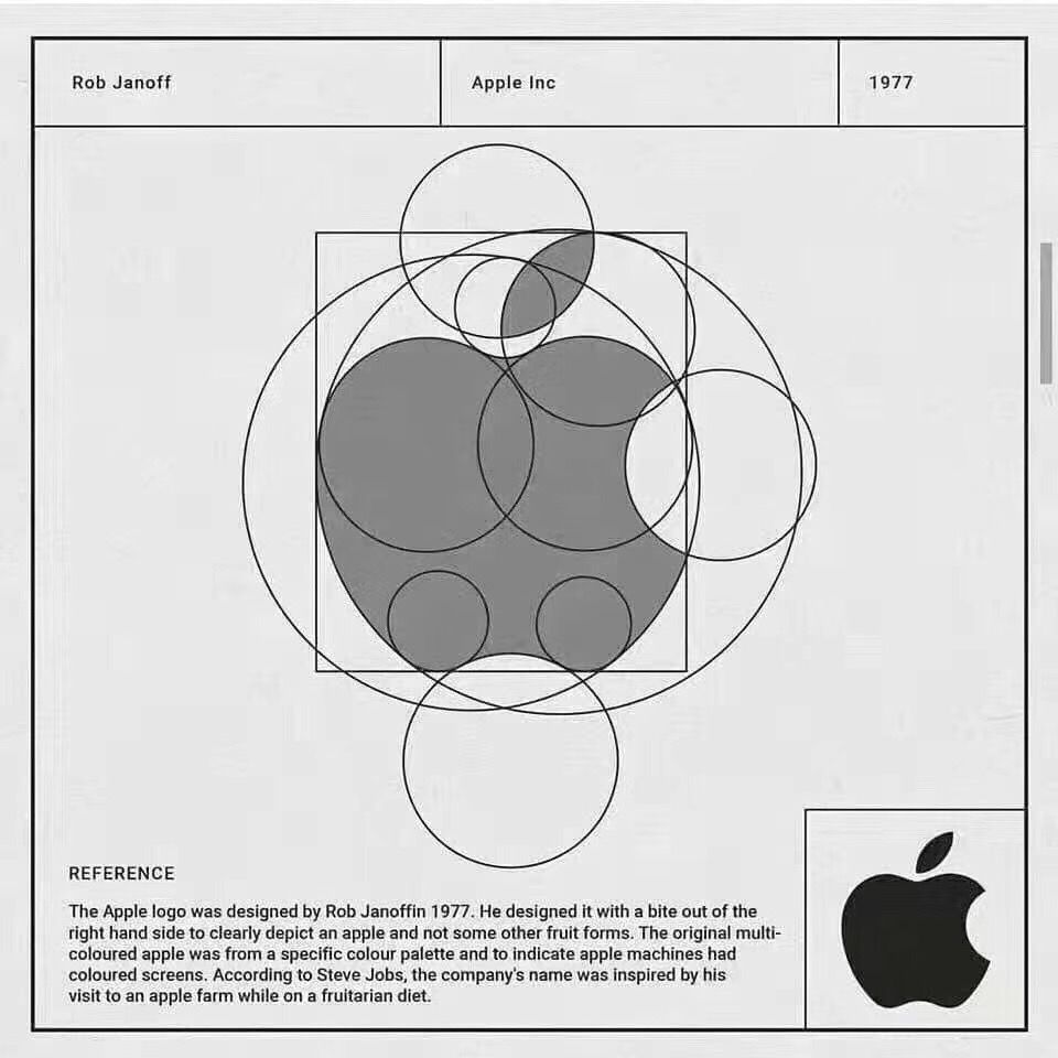
- The isotype: Mainly used by well-known brands. This is the image without text, called a pictogram. For example Mcdonalds or Apple. In other words, we already know which brand it refers to just by looking at the image.
- Isologo: This is when a symbol is associated with a typeface and they always go together, for example, BurgerKing or BMW.
The keys to a successful logo
Having seen the different types of logos that exist, it is time to ask the question: what really makes a logo successful? It is true that there is a subjective part, we can like or dislike his graphic style, but there is another objective part which consists of following a series of rules so that everything goes well and in the end we get a high quality logo.
Let us see what these rules are:
- There must be an idea behind it: you have to think about how to convey the values of the brand in the logo so that the communication with the customer is better, like, for example, Amazon. Never create a logo without a concept or a story. Remember that to be memorable, the idea must be reflected and captured.
For example, in the case of Amazon, the logo tells 3 stories:
- They have such a large catalogue that you can find products from A to Z, they have everything.
- In addition, your purchase is delivered from point A to point Z.
- They let us know that they do everything with a smile.
The logo should be consistent with the brand: One thing that helps us build the personality of the brand is to imagine it as if it were a person. This allows us to clearly define its personality and the traits that define it. Every brand must therefore have a personality, be true to it and know how to express it in the logo so that it is consistent with the characteristics that define it.

It must be easy to read: the logo must be easy to read and not confusing. Make sure that the text in the logo can be read correctly.

That it is readable at a small size: Often, when we have to reduce a logo in order to put it on different media, it is not quite clear to read because it is very full of elements and these are lost when they are reduced. So remember not to overload the logo with too many elements so that, when it is reduced, it remains clear to read.
Make it timeless. It is true that you can follow trends, but you should not abuse them. Trends that are fashionable today may not be so in some time. A logo is something that has to last a long time, so if you want it to last over time and not look outdated over the years, you have to make it last over time.

It should be pleasing to the eye. Do not make logos that are unpleasant to the eye, either because of the shapes or the colours.

It must be easy to reproduce: if you have to make a logo on different media, it must be easy to reproduce to be well readable.

Create different versions of a logo: It is possible that you will have to place the name of your logo in several places depending on the medium in which you want to reproduce it (vertical, horizontal, square), so think of having a main logo and then several versions depending on the format in which you want to reproduce it.

That it is designed with a grid: When creating a logo, if it is designed with a grid, the final result will be much more professional.
Do you need a logo?
The world of logos is really vast and we are going to put more content online, because the creative process of designing a logo is really interesting. Don’t forget that you can contact Trucker360 if you need any type of advice on designing a logo for your project.
We are waiting for you!